Friday, May 9, 2008

One for Good Luck


A final color blog, just incase.


Pointillism came about in the 1880’s as part of the Post-Impressionism movement. This technique consisted of carefully plotting out and creating images composed of dots of only primary colors. A wide spectrum of colors is then created through the use of optical illusions. Impressionists really cracked down to the core of color, realizing that simple placing to primaries together in close range will cause the viewer to see a secondary from a distance. The artist to really make this famous was Georges-Pierre Seurat. His famous work, Sunday Afternoon on the Island of La Grande Jatte, is the perfect example of pointillism. One could look for hours at the all the color work/theory and planning he applied in his work.

Image from:http://en.wikipedia.org/wiki/Image:Georges_Seurat_-_Un_dimanche_apr%C3%A8s-midi_%C3%A0_l%27%C3%8Ele_de_la_Grande_Jatte_v2.jpeg
Finished

My project is finished, and as in most cases, it is a bit different from what I had originally intended. I became less specific in my subject matter. Instead of picking specific countries and their colors (with the exception of ‘Uncle Sam’), I went with ethnicities and chose to leave them black and white. After gluing it all down I went to add the color to the children and realized that if I did so then I would lose an important aspect of my piece.
The concept is that the United States views itself above all other peoples and nations in the world. Uncle Sam’s red, white, and blues shine out brightly, making a nice contrast with the black and white children following behind. Our mindset is that we are better; therefore we get to have color. To make the black and white stand out, I stained the collage of images in the back and text with watered down, brown acrylic paints. This makes it look worn and batter, matching the devastation that is rampant in the background. Over all I am very satisfied with how my project turned out.

Friday, April 11, 2008

Baby Vision

How did the red heart become the symbol of “love”?

“Originally pronounced "I love", the phrase has recently been used by young hipsters who have taken to facetiously verbalizing it as "I heart".” ** this doesn’t really have anything to do with what I’m writing… I just thought it was funny.


Can Babies See in Color?

It has always been debated what babies can see in the early steps of infancy. I’ve always heard that babies are unable to see soft pastels. It has also been promoted that using back and white toys helps to stimulate and aid in the child’s visual and mental growth. In an article by Russell Hamer, what a baby can see is laid out in layman’s terms.
According to Hamer, babies are attracted to high contrast, thus the peaked interest on toys and clothing that have wide geometric patterns. Slight color differences like a shift in hues or really light pastels. Recent research done by the University of California “have shown that infants as young as 2 weeks of age have color vision and can distinguish a red object from a green one even when these are perfectly matched in brightness.”
The white and black toys, clothing apparel, etc probably only has one use, making money. In Hamer’s opinion, it really just doesn’t matter if you have your baby’s room decked out in all black and white. In fact having a colorful room is “rich and stimulating to your baby”.


Citation:

Hamer, Russell. "What Can My Baby See?." Parents' Press Vol. XI, No.IINovember 1990 11 April 2008 .

Glazes

Pottery only looks good when it’s in three of its five possible stages. When a piece is fresh off the wheel, it has a nice wet, glossy texture. As the clay reaches the drying stage known as ‘leather hard’, it gets a soft sheen. As the clay dries (wet clay in a kiln is a recipe for disaster) it goes into the “bone-dry” stage and then its fired for the first time. It is at these two points where the clay looks its worst. It’s drying, depressing, and every flaw is visible.
This sad state begs for color and that’s where the glaze comes in. Making color choices when glazing is very important. Each glaze has its own personality and, just like people, if you mix two of the wrong type together you get a very ugly situation. When it comes to color and glazes, there is no exact science involved. Besides a basic knowledge of how it works, the field is basically open for experimentation, failures, and success.
The possibilities are amazing. A bright, flat color is possible, making the pot pop with life. There are also earth tones that have the ability, through careful layering, to create such a sense of depth that it feels as though you could put your hand right through. Texture is a big issue with glazing as well. A glaze an crackle or bubble and at times that can be very desirable. Color and glaze texture can make or break a piece.

Grays

In high school, all of my art classes spent time focusing on color theory. I find it interesting, however, that of all my teachers, not a single one went into making a series of gray through using complimentary colors and the three primaries. As I sat there mixing furiously in Visual Concepts, frustrated at the task at hand, it suddenly clicked. This was why in all my paintings, when a gray was used they were dull and lifeless.
I had spent all this time considering gray as a mixture of simply white and black and felt frustrate when a painting would come out lacking. Colors are the most complex aspect in art. It’s never a simple matter of one color, as I’ve been realizing. A great work of art requires the artist to be bold. Throw in a hint of a color normally reserved for something else and your piece pops from the canvas.
I had a portraiture teacher once who touched on this. Her approach to painting involved many different layers. You drew, then you painted in a series of greens in acrylic, and then you could move on to oil paints. She also made a point to add in colors you normally wouldn’t expect. Add a bit of blue on the cheek line and nose and suddenly the entire lighting of the portrait changed. It made since, and while it was a pain, the results were worth it in the end.

Final Project Idea

For my final project I plan to make an ironic/parody remark on how we simplify our Nations history. I will use mix media, most likely collage and drawing materials. The background will manly consist of images of poverty/Native Americans/etc and/or other images of strife either indirectly or directly caused by U.S. aid or lack thereof. In the foreground will be a typical American caricature of either the “U.S.” or some Capitalist big shot from the 19th, early 20th century era. Following “America” will be small child-like caricatures of other nations. Color will be a key factor in determining who America is and who are the nations following. I will use acrylic paints to signify who is who. Along with the images will be a quote that I have in mind that will further strike home the point that throughout American history we have damaged others through our belief that we are superior.

Friday, March 28, 2008


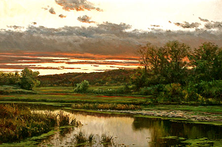
Recently I took a trip to the East Building of the National Gallery of Art. The current exhibition is titled In the Forest of Fontainebleau: Painters and Photographers from Corot to Monet. Paintings rich in texture and detail line the walls in ornate frames along with early photographs containing ghostly images of the famed forest. What struck me the most as I meandered amongst the other tourists, listening to audio tours and chatting amongst themselves in the awed sort of whisper that accompanies the presence of fine art, was the use of color. Color wasn’t splashed about in bold shapes like a Picasso but rather used in warm tones that made the paintings glow with vibrant life.
Through color, the artists that painted scenes from the Fontainebleau captured the way light filters through the forest in a way that really just draws the viewer in. Light really is one of the hardest things to portray in painting or any art medium in general. The paint is laid on thick so the color just leaps out and all of a sudden I am actually standing in the forest path, sunlight filtering through the tree branches to gather in warm pools of light on the ground. It takes a lot of conviction to lay color out on the canvas in such confident strokes and dabs.
Joan Colomer painted the Forest and other landscapes with great attention to the way light made the scene. His attention to the sky brightens the painting. His work, After the Storm, is a perfect example of his amazing use of color. His work is naturalistic, there are no neon pinks to be found, but he uses bold color to attempt to capture the majesty of the moment. The setting sun illuminates the parting storm clouds with a red that zips off the page and hits the viewer with a marvelous and resounding smack. He then draws the viewer’s eye down to the bottom of the painting by the reflecting light of the waters surface. When color is used in a painting, in my opinion, it’s meant to bring that image to life. The paintings on exhibit at the National Gallery are a perfect example of that.

Joan Colomer, After the Storm
image found: http://www.bluehillbaygallery.com/p/colomer24x36.jpg

Friday, February 8, 2008


Here's something about color that has always stumped me. How did it start that Blue was the designated "boy" color and pink the "girl" color? Is it purely a western tradition of sorts to decorate the nursey with the correct corresponding color?

According to Wikipedia:

- pink and blue being assigned to gender is a western tradition.
-in the 1920's pink was actually assigned to boys because "it was the more masculine and decided color while blue was considered appropraite for girls because it was more delicate and dainty."
-in the 1940's this practice had been inverted

I find it a bit amusing that pink was more "masculine" because in the 17th century pink was first defined to describe the pale red of flowering plants in the genus Dianthus. Then again, flowers have a completely different meaning today than they did in the those times. Each flower had its own meaning and to send them to someone meant different intentions. For example, in Victorian times to give someone a Lavender meant distrust while recieving a yellow Chrysanthemum hinted that you had a secret admirer. The list provided by the Society of American Florists is quite interesting. Here is the link:

http://www.aboutflowers.com/floral_b5.html


"Pink." Wikipedia, The Free Encyclopedia. Wikipedia. 8 Feb 2008 .

Pictures from:

-http://www.theflowerexpert.com/media/images/flowerart/flowerphotos/chrysanthemums/yellow-chrysanthemum-4.jpg

-http://www.mooseyscountrygarden.com/foliage-plants/lavender.jpg

Friday, February 1, 2008


Write about anything to do with color… those are rather broad instructions. As I said earlier in class, for me color and its strong tie to memory affect me the most. When I was younger, I loved picture books. It wasn’t until I was much older that I paid any attention to the text at all. I’d flip through the pages only to pause at long interval at the pages that held illustrations. It all really left a major impact on me to this day. The way a line created a face or how this certain color struck me in such a way that I would return again and again just so I could stare and experience it again. These childhood memories come back when I’m doing “adult” chores such as grocery shopping. A certain box will just have that certain look to it and I immediately think back on the image in own of my children’s books. The color of the cookie on the bag will bring me back to one of my favorite Bearstein bears books. I know that the cookie probably isn’t going to be that tasty, or that I really don’t need to be spending that much money on a bag of cookies but… I can’t help it. It’s too late and I’m doomed to wasting my money. The strong connection as been made in my mind and I simply must buy it.
The traditional black and white checkered kitchen floor has always had a special place in my heart as well. I may be staring at a floor in my friends house but in my mind I’m looking at a book in which the main character, a mother, has just cleaned her kitchen floor. She has also baked a batch of chocolate chip cookies and everyone in the neighbor hood wants one. Unfortunately its been raining so her spotless floor gets covered in mud. The book ends happily as her son offers to help her clean the floor and they eat cookies together. It’s hard to explain but when ever I come across a color that reminds me of something, I can’t help but smile at the old memory that’s resurfaced

Object Search


It's always a nice change when we have an assignment that pulls us out of our seats. Despite the freezing cold outside, I enjoyed going out and looking for objects and deciphering what their colors could mean. We tromped over to Safeway and there I found a watermelon. For me, when I see the light/dark green stripes on a watermelon, so many memories are attatched. Watermelons mean a warm summer day, sitting on the back patio to your house and spitting the black seeds into the grass. It makes me think of cook outs and lots of family and friends. Coming from a very rural upbringing, this particular melon has frequented my childhood. Also, the melon-green on any other object, no matter what it is, still brings to mind a watermelon. Thus people may describe, say, a shirt as being "watermelon green". The second picture I chose was the mulch outside of the grocery store. Mulch in itself wasn't exactly what I was focusing on, but rather the color and the fact that it's earth. Brown, in my opinion, is the basic earth tone and when I see thiings that are brown I immediatly connect the object with organic materials.